With decades of experience, Ylem EPC are trusted experts in their field. Their core purpose is to save their customers money and help them to reach energy efficiency targets.
The brief
Formed as part of the Ylem Group, Ylem EPC is a new company focusing on long-term, mutually beneficial relationships between client and contractor. Ylem EPC needed a striking visual identity and website that would position them as the market-leader in their industry. Although a new company name, there is a wealth of experience and expertise that sets the foundation of this new venture.
Visit Website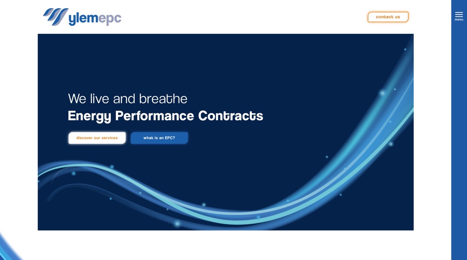
New company, new identity
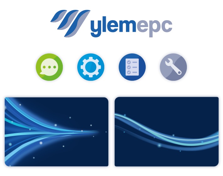
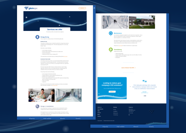
We started with a branding and website workshop with the key stakeholders at Ylem to help with our intelligence gathering and understanding of the business aims. This The icon in the logo symbolises energy performance. The three flames point upwards, containing a wave of energy – suggesting fire, movement and control. The incrementally sized flames represent varying amounts of energy consumption, and the triangular composition resembles the shape of the letter ‘Y’. The visual identity elements we created represent energy waves, which are used throughout the website. We also created icons for each of their services, which again have the subtle wave in the background, which is in keeping with their new identity.
Bringing the identity to the web
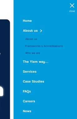
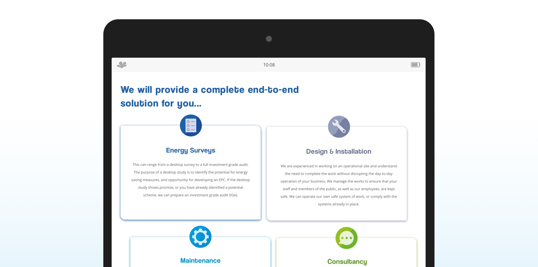
We wanted to ensure that their slick new identity was reflected across all platforms. Their website is clean, bold and full of subtle elements that reflect their logos and visual identity elements – such as corners that reflect the shapes in the logo, and shadows that reflect the energy waves in the hero areas. The website follows a simple structure, allowing the user to quickly find the information they’re looking for. When we had been supplied with content for pages, we realised that some of it was very long and could be off-putting for a user. To combat this, we ensured the content was sectioned out under bold headings, and added a sticky navigation to the page, allowing the user to find the section they needed without having to scroll up and down the page.
The outcome
We have created a professional, modern, striking presence for Ylem EPC both online and offline – allowing them to use their visual identity as they go forward and become an authoritative figure in their industry. It was important that the team at Ylem EPC has an identity they could be proud of, talking face to face with a lot of their potential customer, the website needed to work hard for them as a sales tool. Representing the professionalism of the team, the belief in achieving a better outcome for the customers and a promise of long term contracts for their service providers, the website reflects all of these aims in content, identity and user experience.
Some more work