Cyfor are a leading provider of eDiscovery, Digital Forensics and Corporate Investigation services. Their breadth of experience and bullet-proof secure infrastructure enables them to operate at the highest level on a vast range of investigations.
The brief
Cyfor already had a web presence that was reasonably well-structured and had some good content. However, the design, identity and usability of the site was neither eye-catching or engaging. A key objective was a visual overhaul of their branding, visual identity and website design with the company logo to remain unchanged. As a part of the update, they also requested an in-depth website audit – looking at the website information architecture, page layouts, design, load speeds and analytics. Due to the nature of their business, website security was also a technical development requirement we had to address.
Visit Website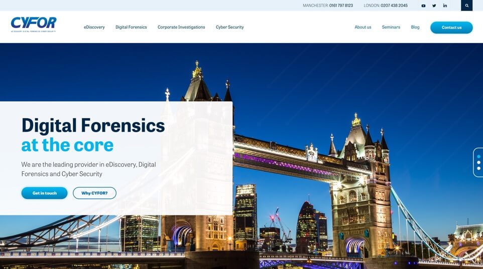
Branding overhaul
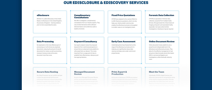
Each service had its own multitude of sub-services, and so we felt it would be best to visually separate these, so that viewer could easily and quickly identify which service content section they were navigating through. We decided to give each service its own iconographic design, conceptual of the service it represented, these were individually illustrated in flat outline style to compliment an overall art direction of the new visual identity system for the website.
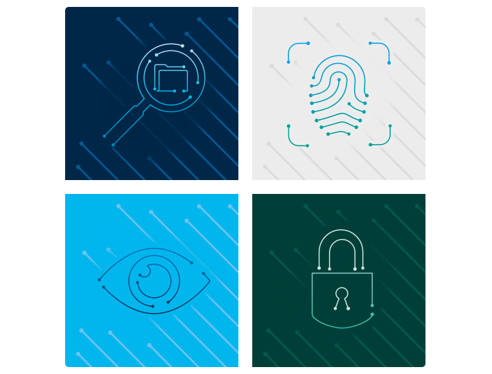
Creating a new visual style
The illustrations represent Cyfor’s business areas conceptually – a magnifying glass to represent “discovery”, a fingerprint to represent “forensics”. The style of the illustrations represents the movement and storage or electronic information. The thin lines with circular points at the end suggest movement of data from one point to another – they also suggest electronic circuitry and computer hardware.
The colour palette is an extension of Cyfor’s logo, which uses a dark blue. We chose a contrasting light blue, and a complementary green for flexibility and interest. In addition, we also added a neutral grey, which works alongside the other colours with ease. The colour palette allows for differentiation between services, but when used together, none of them appear as more important than the others.
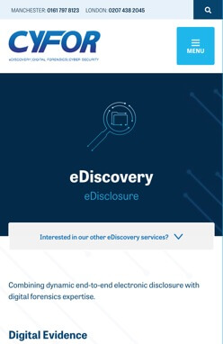
A bold new website
After studying analytics on visitor activity based on the previous website, we were happy with the structure of most of the pages – they had relevant information that was required and needed to remain in place, but there were areas that were difficult to navigate, and were not visually engaging, so we set about correcting these.
We restructured sections of every page on the website. We were constantly considering how we could make the navigation and content easier to understand, particularly given the complex nature of some of the written content. Our goal was to make the site user friendly, helping visitors find the information they were looking for, without being hit with walls of text.
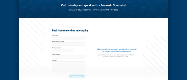
The style we created is clear, simple and bold. Each page has a logical structure, and always gives the user a quick way to contact Cyfor. A user does not need to leave the page they are on, or scroll back to the top of the page to find contact information. Once a user hits the end of a content area they will always be presented with ways to contact Cyfor via a call to action form.
The outcome
We have given Cyfor an engaging new website with brand overhaul, their visual identity is now modern and bold – allowing them to stand out in the crowd. With the new branding in place, we were able to create a visually attractive website that is easy to navigate. The content is now carefully curated and split into digestible chunks meaning it is easier on the eye and no longer overwhelming the site design.
We selected Carbon Creative to design and create a new website that would take CYFOR to the next level. The team were supportive and responsive throughout every stage of the build, resolving any issues without delay and working intuitively with our marketing department. All objectives that were outlined from the offset have been accomplished, culminating in a solid brand identity and a 30% increase in site traffic. I would not hesitate in working with Carbon Creative in the future or recommending them to associates.
Stuart B, Marketing Manager.
Website Traffic Increase
New Visitors
Some more work