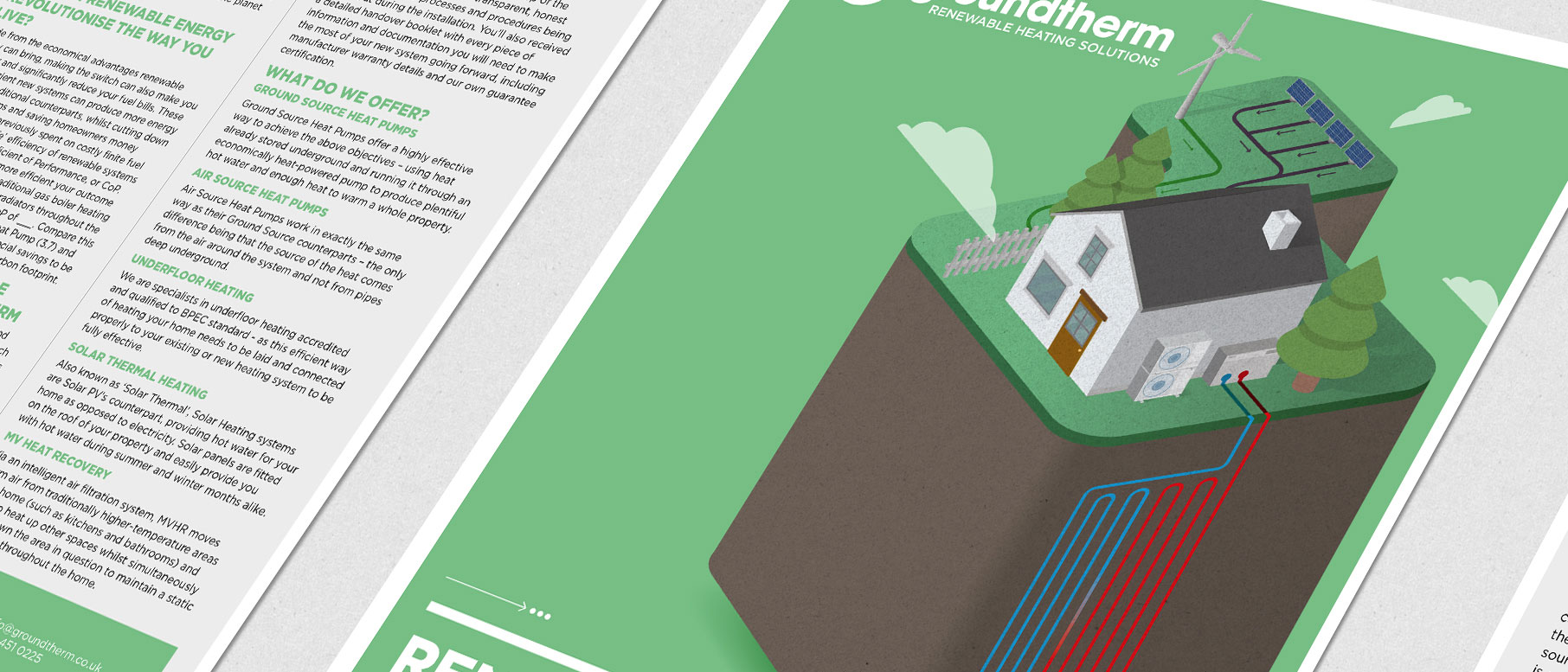
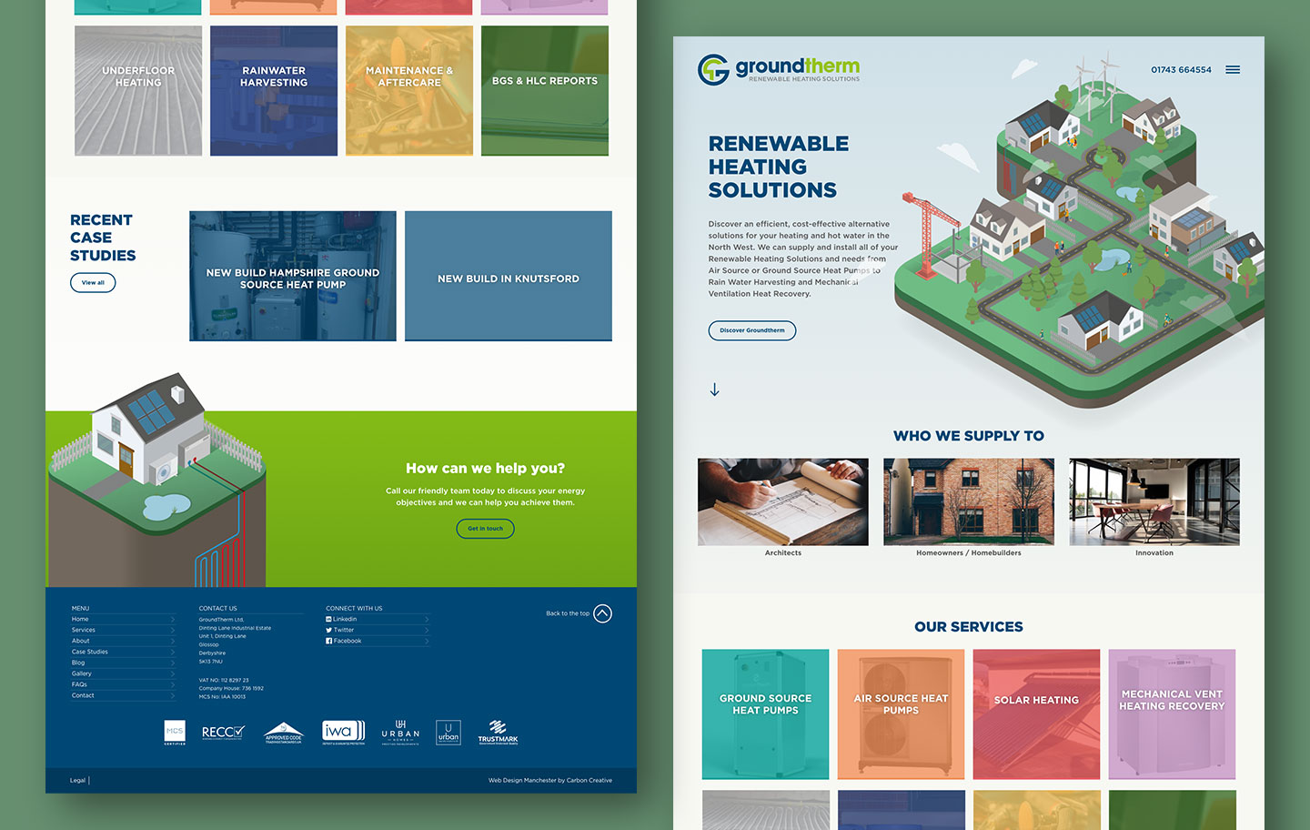
Groundtherm | Brand Identity and Website
Groundtherm is a long-standing, family-run business with over 15 years’ experience leading the way in renewable heating. They’re specialists in designing and installing sustainable heating systems that work beautifully for both homes and businesses — from heat pumps to underfloor heating and everything in between.
What really sets them apart is their passion for doing things the right way — combining technical expertise with genuine care for their customers and the planet. Groundtherm isn’t just about heating spaces; they’re about building a cleaner, greener future, one installation at a time.
Turning up the heat
We partnered with Groundtherm to refresh their visual identity and marketing materials, creating a cohesive, contemporary brand that truly reflects who they are today. Through a full rebrand, including logo development and illustrated campaigns, we helped Groundtherm better communicate their expertise in renewable heating and their commitment to a cleaner, greener future.
With no definitive brand identity and a mixture of styles, a full rebrand of both their logo and marketing materials was a great way to breathe new life into this family run business.
The brief
When Groundtherm first came to us, the brief was simple — refresh their event folders and inserts to help promote their business and spread the word about the benefits of renewable heating.
But as we dug a little deeper, it became clear there was a bigger opportunity. With no strong visual identity and a mix of styles across their materials, we all agreed it was time for a full brand rethink — a chance to create something cohesive, contemporary and unmistakably Groundtherm.
A new look
Groundtherm recognised the power of a full rebrand, and our first move was to breathe new life into their logo — giving it a fresher, more contemporary feel.
We wanted the new identity to reflect who they truly are: dynamic, sustainable, and forward-thinking. The logo takes its cues from the name itself — the G and T cleverly intertwine, with the T branching out like a tree and the G forming a globe that wraps protectively around it. A simple idea, beautifully executed, symbolising Groundtherm’s commitment to a greener future.
Mini sustainable community
We wanted to give Groundtherm a fresh identity with real standout power — something that would put them a step ahead of the competition. After bouncing around moodboards, styles and ideas with the client, we landed on an illustrative route that felt spot on for the brand.
Groundtherm’s world revolves around renewable heating and its positive impact on people and the planet, so we channelled that into a playful concept — a ‘mini sustainable community’ brought to life on the front of the folder. The story continues through the inserts, with hand-drawn houses, product details and a warm, carefully curated colour palette that pulls everything together beautifully.