Services employed
Web
Kingsland Drinks are a drinks specialist providing innovative solutions to the UK trade and beyond. From product development to product packing, Kingsland Drinks do it all.
Established in 1955, they are now employee-owned and focus strongly on developing sustainable solutions with their Thirsty Earth programme. Kingsland Drinks strategy drives targets on environmental impact, social responsibility, and economic practices, including waste reduction and renewable energy, seeking to create a better society and drinks industry for all.
Kingsland Drinks’ original website no longer reflected the vibrant, innovative, and forward-thinking business they had grown into. Technological advancements in web development and the evolution of their brand meant it was time for a full overhaul, both visually and in terms of functionality. Their key goals included:
Modernising the visual design: To represent the business as it stands today and create a lasting impression for visitors.
Improving user experience: Ensuring users could quickly understand Kingsland Drinks’ services and ethos.
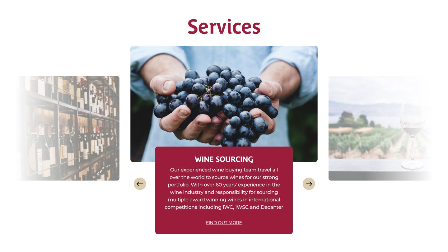
Boosting visibility and engagement: Highlighting their most profitable services and driving increased traffic to the website.
Enhancing recruitment appeal: Encouraging potential employees and partners to see Kingsland Drinks as a company they’d love to work with.
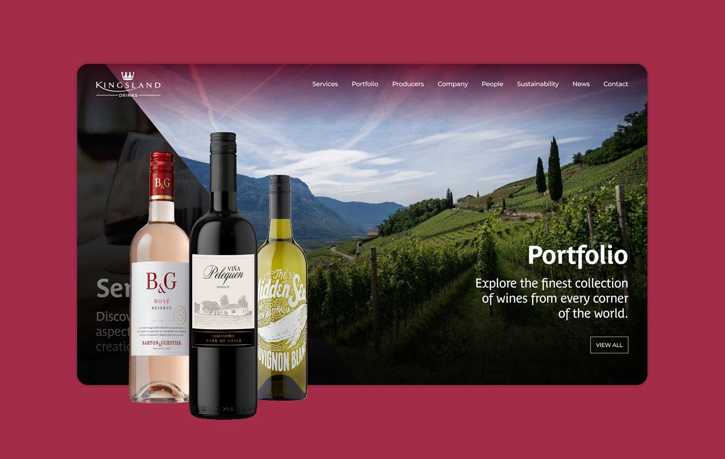
Kingsland Drinks expressed a desire to move away from the illustrated, infographic-heavy style of their old site, which they felt had become outdated. Instead, they sought a photography and videography-led design that showcased their services, people, and processes in a dynamic and visually engaging way.
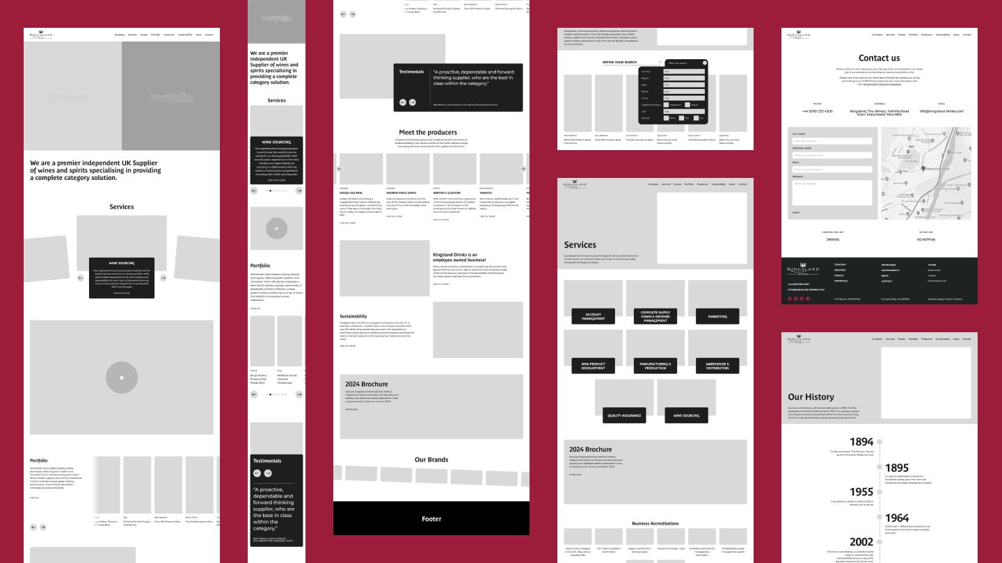
With their impressive library of professional photography, we crafted a design that showcased their visual assets to maximum effect, bringing their story to life. Kingsland Drinks favoured a modern, clean aesthetic. To align with their preference for white space, we embraced a minimalist design philosophy. This clean layout ensured their content remained the focal point while enhancing readability and accessibility.
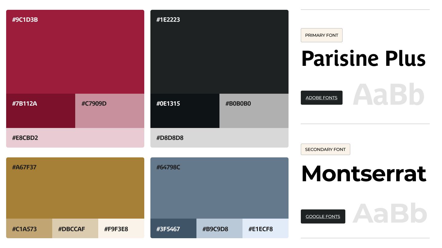
We used their brand colours of red and gold to pull out key information and use of accents. We also introduced shapes which we pulled out from the logo to break up sections. To keep the site fresh and interesting, we came up with a series of modules that we custom designed to ensure all types of content was accounted for, easily digestible and interesting.
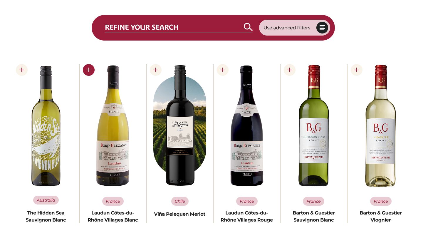
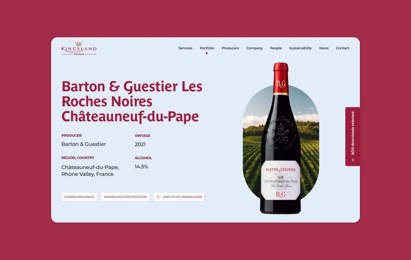
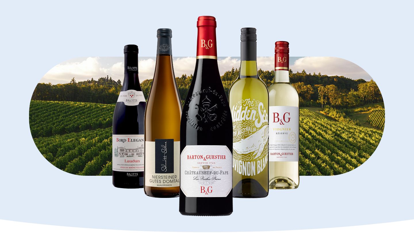
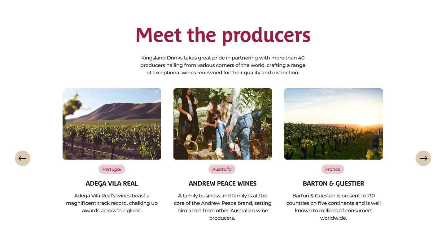
One of the main parts of the website was the Portfolio section. We allocated a lot of time to this section as it was one of the most used areas of the site. We linked the portfolio section with the producers section, so that when a user hovered the chosen wine, an image appeared on hover to show who the producer is. The bespoke solution also meant they could have all the product info be pulled back off into a spreadsheet/CSV file in one go from the back office.
Similarly, on the front end functionality needed to be there so that users could download multiple PDFs/images would be to have a kind of “Add to basket” feature, allowing products on multiple pages to be grouped and downloaded together. Also less likely that the visitor will lose their selections.
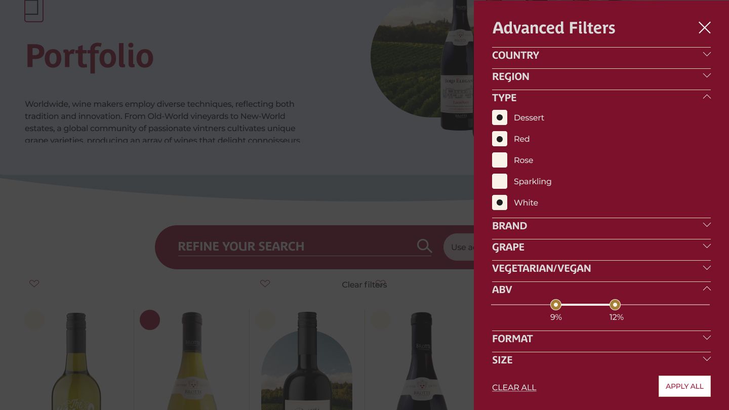
We also created a custom search and filtering system, so users could either add a key word or use the advanced filters if they knew what type of wine they were looking for or narrow it down.
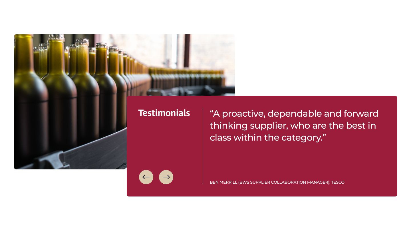
The website’s overhaul has received glowing reviews from Kingsland’s clients and users. The intuitive navigation, enhanced design, and user-friendly functionality have made a lasting impression, reinforcing Kingsland Drinks’ position as an industry leader.
One of the project’s key goals was to attract top talent, and the results speak for themselves. Potential employees have provided overwhelmingly positive feedback about their experience using the site to learn about Kingsland Drinks and apply for positions. This success underscores the website’s effectiveness in communicating Kingsland’s values and culture.
The streamlined visual design ensures the website remains clean, modern, and on-brand. The use of white space combined with Kingsland’s bold accent colours creates a professional yet inviting aesthetic.
– Emma Fairclough