EMQN are a not-for-profit organisation promoting quality in genetic testing by establishing, harmonising and disseminating best practice.
The brief
EMQN’s old website had lots of traffic and active users, but had become outdated, performing poorly in search engines and wasn’t built with mobile in mind - in short, it needed completely rebuilding. At the same time we were asked to overhaul the branding and visual identity, bringing in to focus on the target audience the organisation was working with; the kind of challenge we love.
Visit Website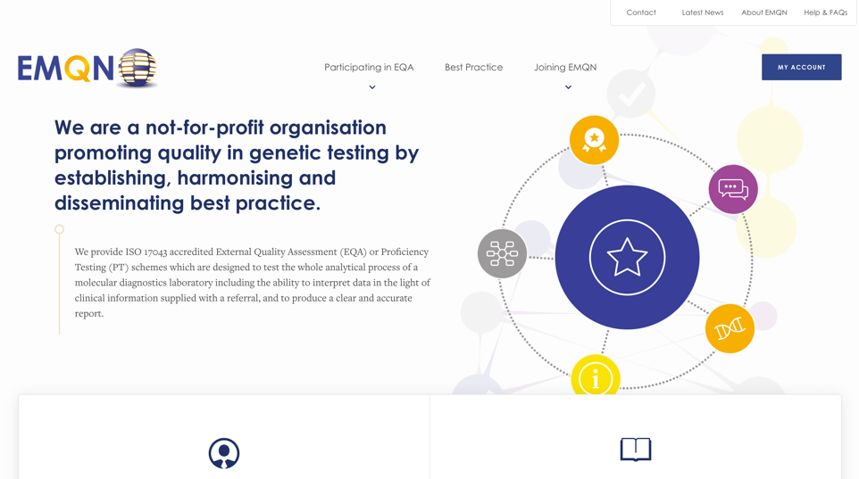
The colours & brand
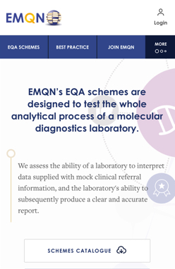
We created a striking colour palette with a nod to the original branding – two shades of blue as the primary brand colour, accompanied and complemented by shades of gold and purple. These colours were used within illustrations on the website and in marketing collateral, combining molecular structures and helix shapes to build on a scientific yet approachable feel. The combination of serif and sans-serif typefaces helped further embellish the visual identity which were to be used on published reports & internal marketing.
Modern & mobile first
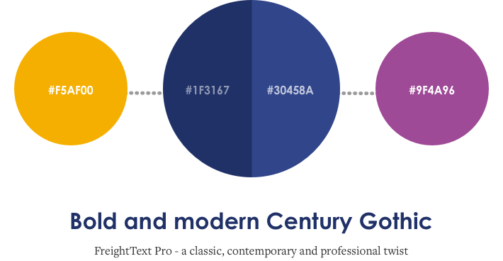
We were keen to address the lack of mobile optimization of the original website from the beginning of the design cycle. We created mobile wireframes and iterated upon designs that helped define and refine the user journey and UI, helping us maintain a clean, easy-to-use interface for mobile, tablet and desktop. This was vitally important, especially on the search pages where the UI needed to present lots of relevant, searchable information to the user.
Navigation was also (obviously) a key part of the website that we had to simplify – we tested and refined user journeys with visual sitemaps and user stories, and decided upon using a more app-like navigation bar on mobile, with the key pages always available on-screen, as opposed to being tucked away behind a menu. We replicated this simple feel on desktop, with clearly defined primary and secondary navigation.
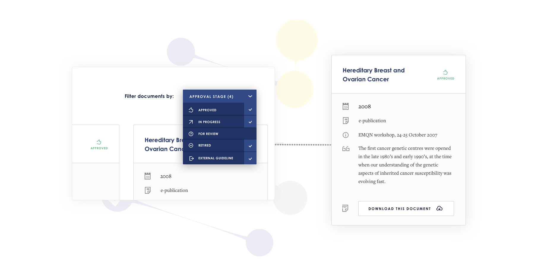
This website is designed for the next wave of Geneticists and so the technical content on the site gave us a great challenge in presenting a more aesthetic & intuitive design for them. The sophisticated transitions & filtering system was important for us to get right, the more enjoyable the experience of the website as a whole, the more conversions EMQN would get. This means laboratories signing up to test schemes & gaining accreditation, a process which we feel should start auspiciously.
Informative, performant & modern
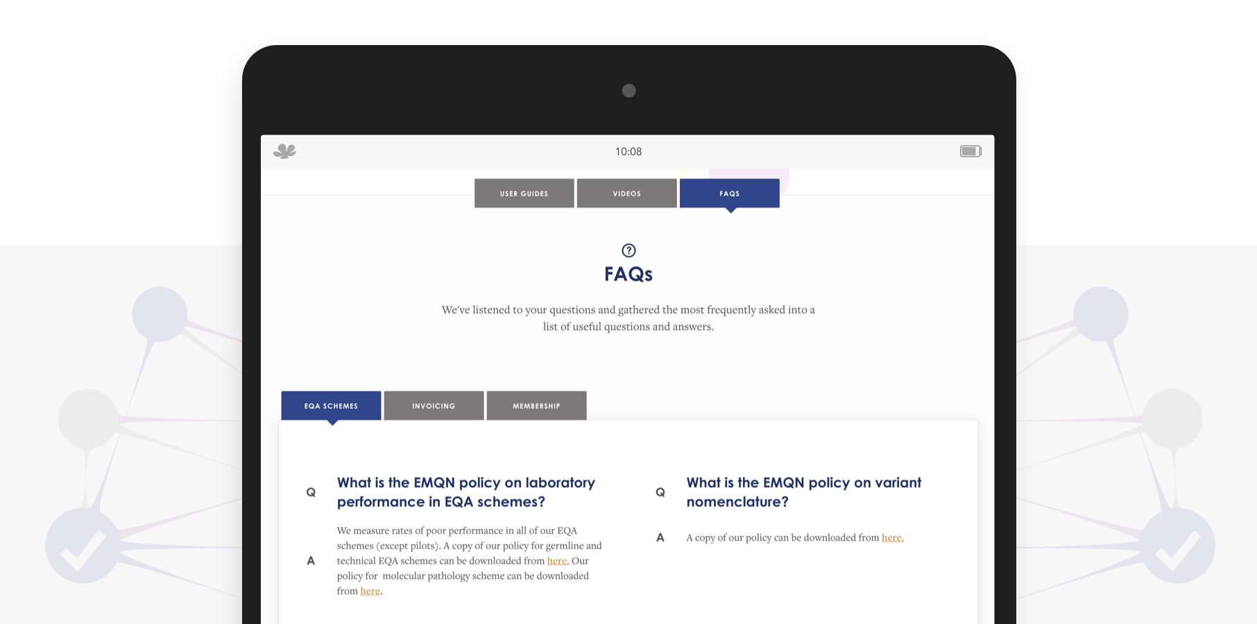
Working together with the EMQN team we created a help ‘hub’ where users can get answers to the most commonly asked (and sometimes more obscure) questions all in one place on the site. By organising this content into different sections, users can now easily switch between user guides, videos and FAQs. As the schemes offered are constantly evolving and growing, it was essential to build this on a platform where the team at EMQN HQ could add more information as they were getting feedback from live tests, addressing an individual issue globally.
Along with making the website easy to use and performant, we wanted to enhance the experience by adding subtle animations and transitions on page-load and hover. This was the icing on top of the cake for us. We relish in creating beautiful on page surprises that bring a smile to every user, something unexpected that can enhance an experience & make a moment at work in the lab improved, if not exceptional.
Load up the website and check it out for yourself!
I'm very happy with the new website – please pass on my sincere thanks to your team but especially to Harriet, Chris and Craig.
Dr Simon Patton, Director of European Molecular Genetics Quality Network
The outcome
We're super proud of the work we've done for EMQN's website and branding - they now have a website that's built for mobile, optimised for SEO, easy-to-use and satisfies the needs of their customers.


