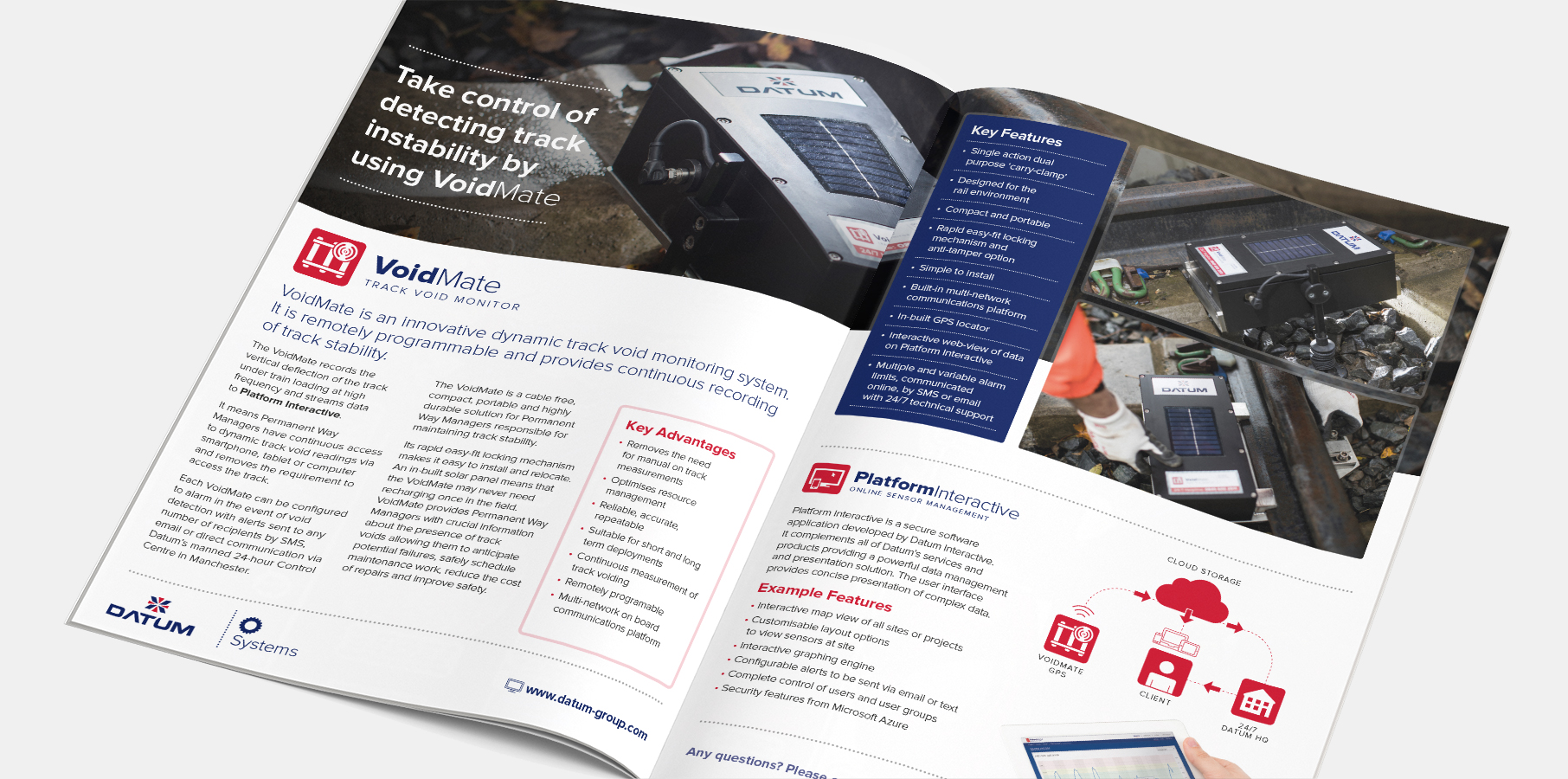
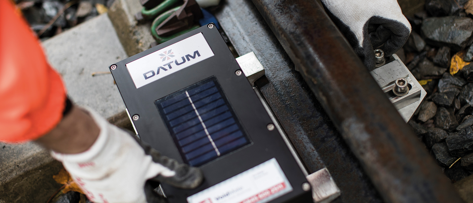
Datum are one of Europe’s leading monitoring specialists with a reputation for excellence in the field of large infrastructure safety and monitoring systems. They develop custom hardware, software and cloud based solutions that continually feedback data to their monitoring centre providing critical alerts of potential safety situations.
Datum Rebrand
When a company is already successful, well known within it's field and performing well, a rebrand can often be hard to justify. However, what we often find is that successful companies can outgrow their existing branding and corporate identity because there was no desire for that brand strategy and foresight at the company inception. Companies that excel purely on the strength of their product and service offer have less reliance on brand in their early growth years and this can lead to a confusing look and feel. When Datum started out, they hired a designer to create a logo but there was no deep thought or rationale behind the identity at the time.
Innovation by design
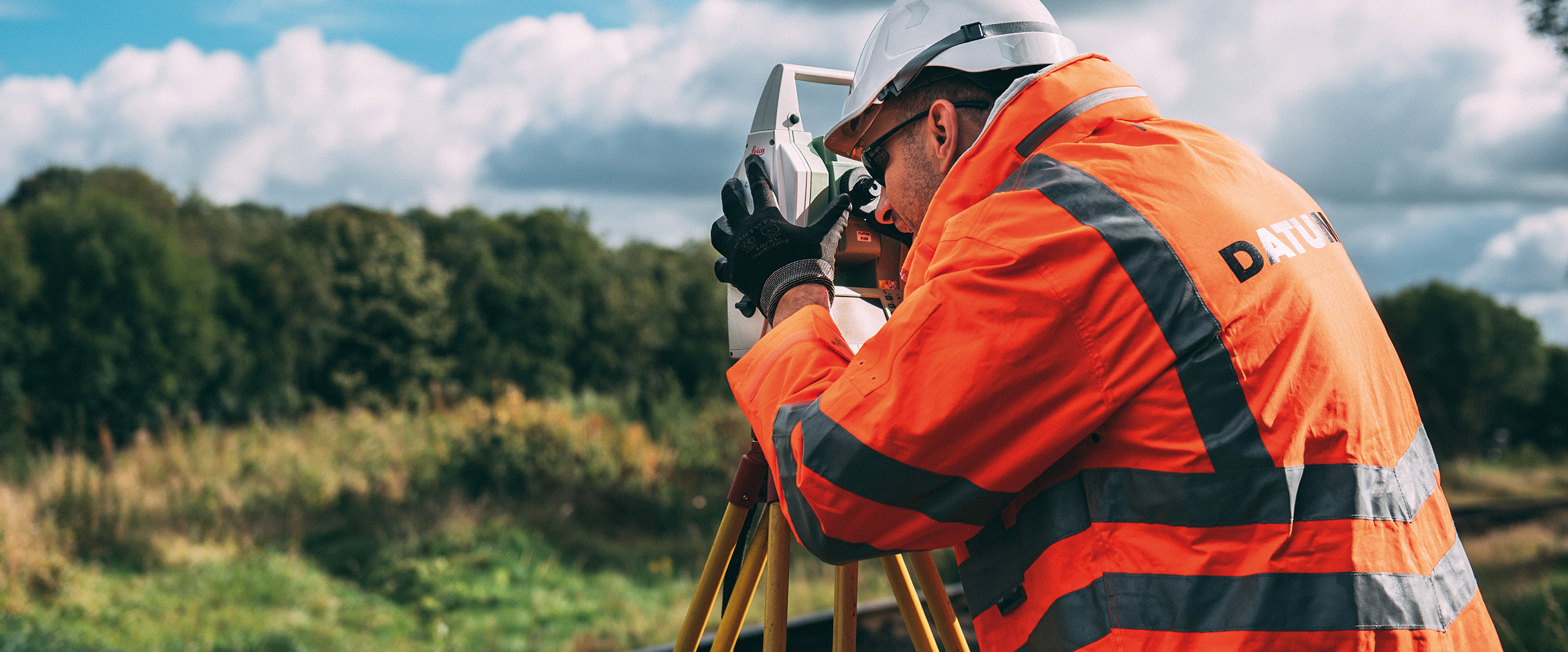
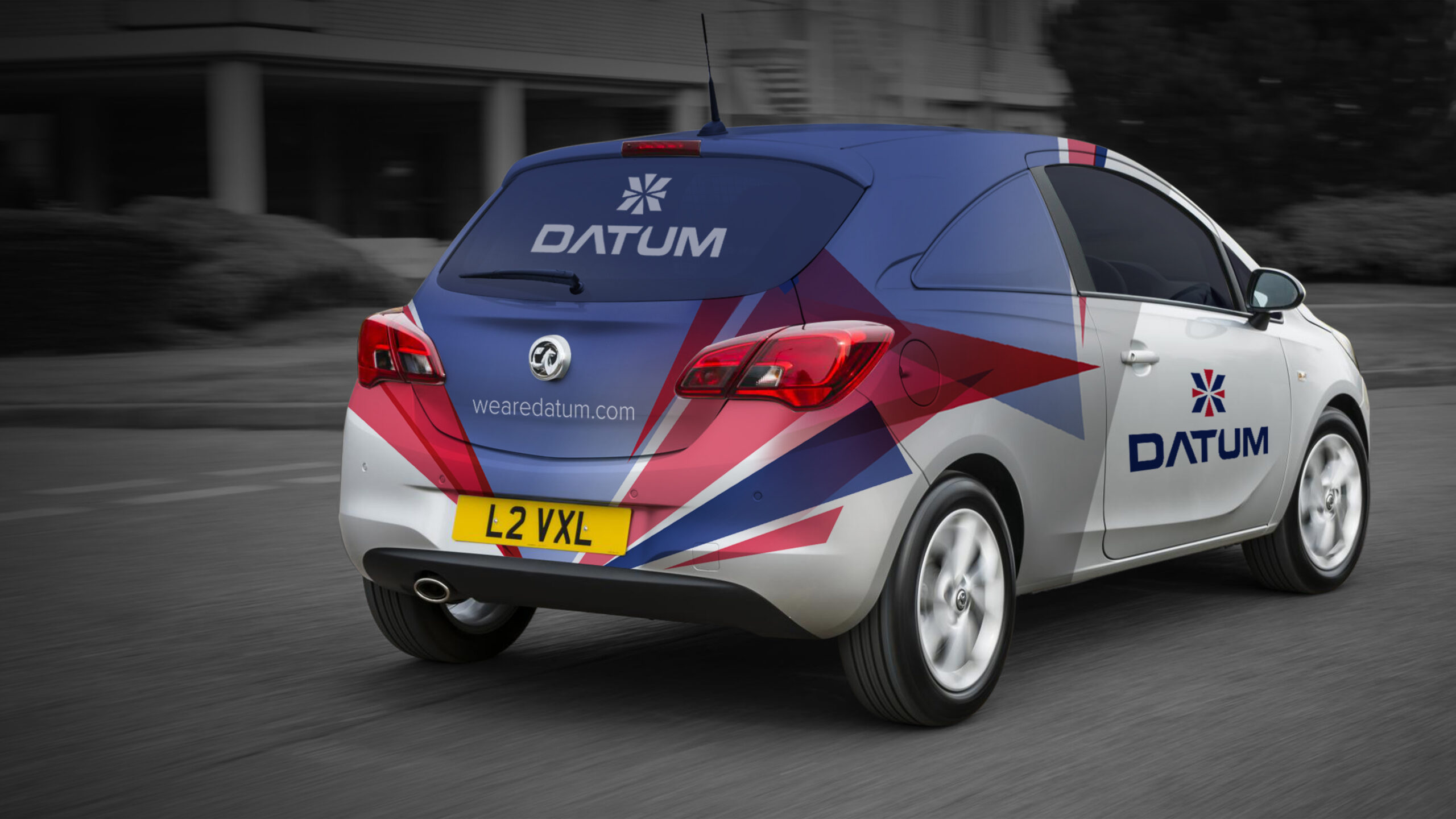
Datum are an innovative and proudly British engineering company, developing cutting edge products that helps keep UK infrastructure safe. Much of their work involves developing sensors and monitoring equipment that use baseline points of reference to check for stability.
For example, measuring the movement of a bridge structure against a cross hair target on a fixed point of land with laser precision. It’s technical stuff full of head scratching azimuths and Pythagoreanisms! In fact the very meaning of the word ‘datum’ infers to this surveying of reference points in space.
Innovation, British engineering and the science of datum geometry therefore became a natural rationale for our logo design. Starting with mood-boards which included images of Union Jacks, datum cross hairs and solid industrial typefaces, we started to combine these symbolisms into a visual form.
The logo needed to feel modern and geometric. British, solid and timeless. We also felt it was important to carry some DNA from it’s logo ancestry.
Our thought process and strategy for the logo was so deeply considered the actual process of development was relatively quick and with only a handful of internal revisions we arrived at the perfect Datum logo.
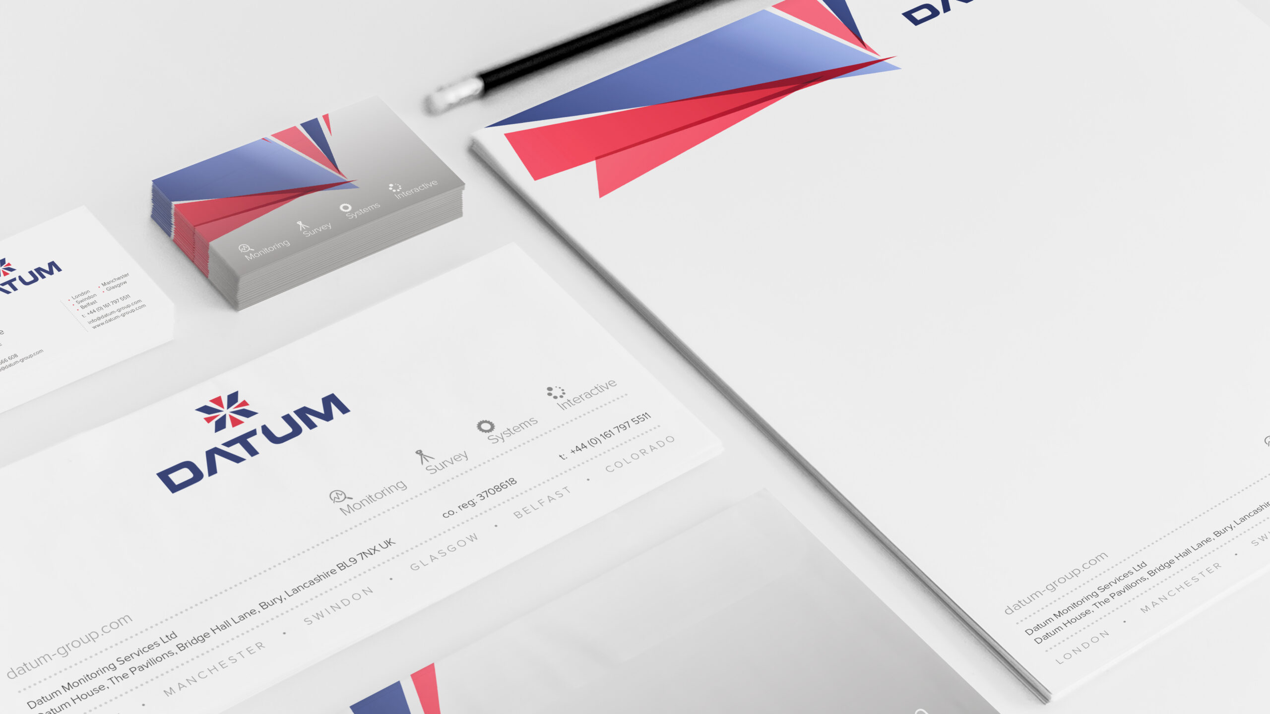
The symbol above the type represents horizontal and vertical Datum reference points, a cross hair if you like, whilst the geometry arrangement is symbolic of a Union Jack.
Below the symbol is the Datum typogram, and whilst at a glance it looks simple enough we managed to engineer datum geometry hidden in plain sight. You may notice the angled negative space between and chamfered edges of the T. Lastly we summoned Fibonacci’s golden ratio for the overall logo proportion.
Illustrations
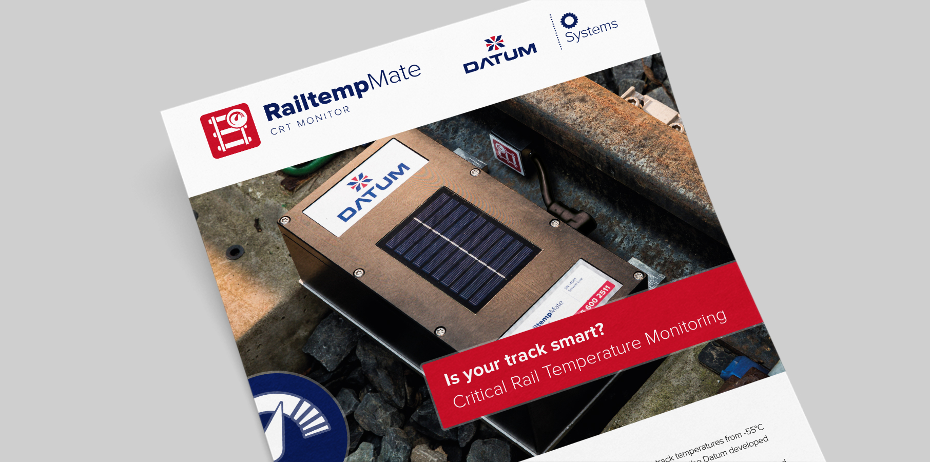
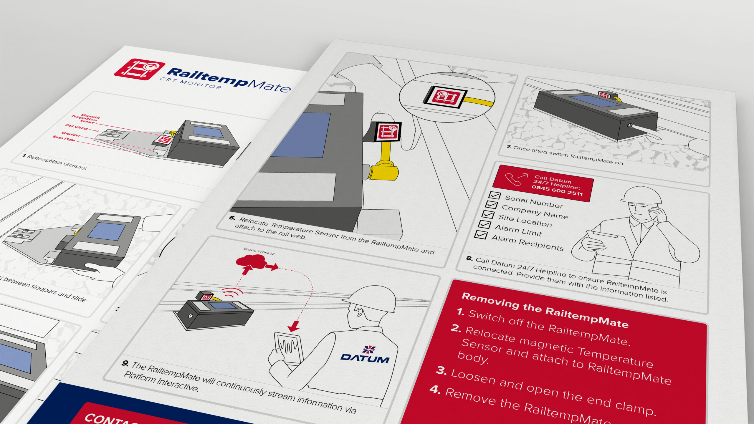
As the new branded materials started to be developed, there became a need for some complimentary materials for the latest products. These included labels, packaging and instructional guides. The technology itself does all the hard work so all the user needs to do is install it correctly. We wanted to simplify this process as much as possible. We created elegant line illustrations, with the focal points and relevant steps being a block colour. The devices were being shipped internationally so it was crucial for the business that it was universally understandable and people in every location could install it successfully. Not just a pretty picture.
Lock up logos
The strongest brands need to be able to grow and evolve without losing the essence of why they were created. The lock up collection we created was for the divisions of the company and within each one of those, there were a series of products or services. The elements of all these had to work together or we would have been straight back to where we started, a brand in discord.