ProSolutions offer is to transform the way organisations provide their current training. ProSolutions gives organisations and businesses the power to create and manage their own training programmes. They cover various areas such as Medical, Office and Administration, Manufacturing, Warehousing, Customer Service and Engineering.
Branding a new start-up company
New start-up company ProSolutions Training offer an innovative cloud-based learning management system which allows them to help businesses identify the gaps in staff training and set up learning paths for employees. The team at ProSolutions approached team Carbon and asked if we could help to with their brand development, logo design and and visual identity.
The brief - Logo design and visual identity
Working collaboratively with ProSolutions, we created a unique logo to represent the business. We see a logo as not just a visual representation of a business name but instead the most valuable commercial asset that needs clear consideration and thought processes behind the design. With this in mind we developed a vision for the brand based around the company’s ethos, that they are proud to have a carbon neutral footprint and are assisting their customers in their fight against climate change.
Our approach
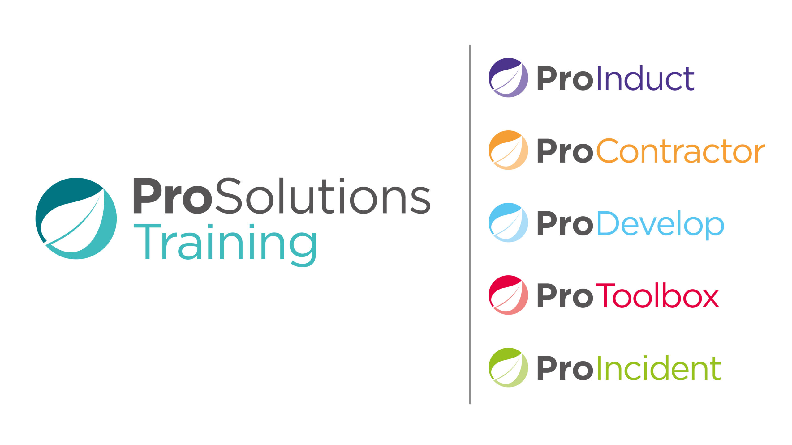
ProSolutions value environmental sustainability, they place it at the heart of their corporate social responsibility, we wanted to embody this ethos into the branding, so we incorporated a leaf into the logo to illustrate the carbon aspect and also to represent the growth of the business. We built on this logo by using the leaf brand mark to present the 6 different products; ProSolutions, ProContractor, ProInduct, ProIncident, ProDevelop and ProToolbox. Each with a different colour to help distinguish the different products.
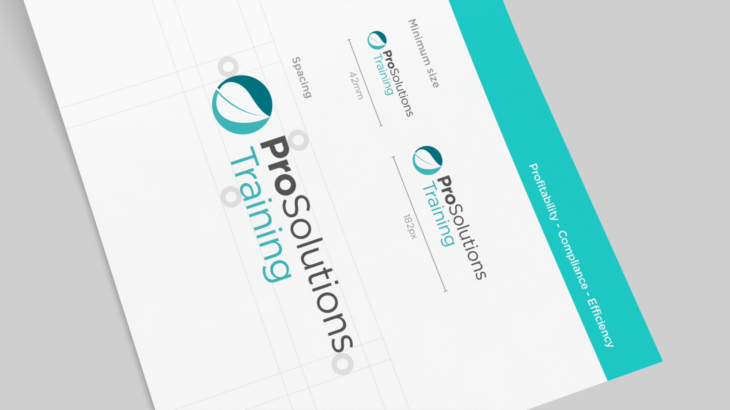
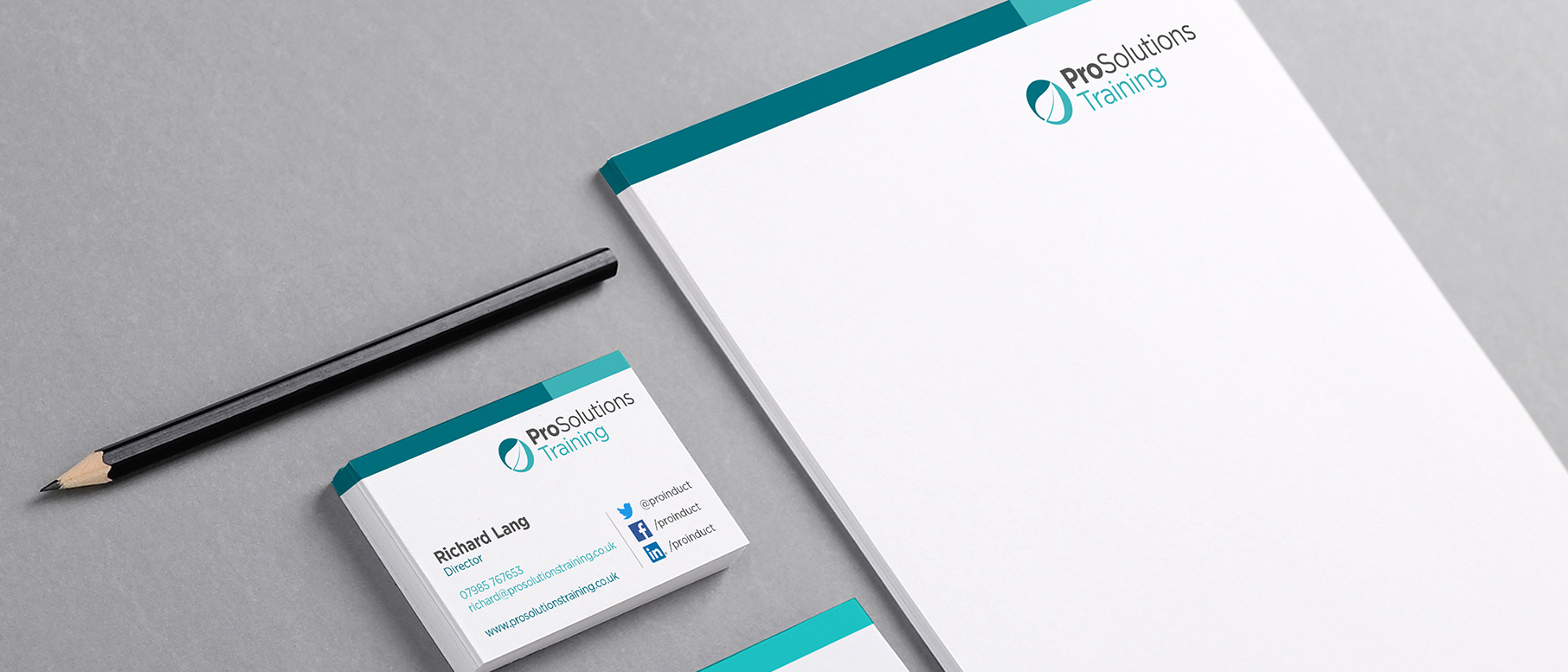
We also created a mini brand guidelines and visual identity document for ProSolutions. The logo is the core of the brand but the identity embodies the whole wider look and feel of the brand which is equally as important. For ProSolutions, the visual identity is vital as it allows for a consistent use of visual elements such as font, colour, imagery and stationary. In a nutshell the identity has been formalised into something documented, consistent, and simple for them and others to follow.