
So what is User Experience (UX) design?
Business goals+User/customer goals+User interface+Backend process = User Experience Design
User experience (UX) design is the process design teams use to create products that provide meaningful, relevant and inclusive experiences to users. It is a substantial and complex field, but one that is imperative to great design and overall user and client satisfaction.
We use a design thinking process in a series of stages to enhance the overall user experience on our websites.
These stages include: Empathise, Define, Ideate, Prototype, and Test – using these stages we can create the best user experience possible.
Within these stages there are tasks such as – defining key users and their goals by undertaking workshops with clients and running them through a series of tasks, defining the user journey and empathising with any current pain points, site mapping and hierarchy of pages, utilising tools such as hot jar and google analytics to provide us with the data we need to improve user journeys, collaborative design iterations and prototyping and finally on going testing to ensure we have perfected the user experience and continue to provide support.
What User experience (UX) design isn’t:
• Isn’t about cosmetic buttons or pixel pushing on software
• Isn’t just about the user, it is also about the business goals too of our clients
• UX isn’t a check box or a step in a process it must be a continuing effort to evolve the process
• UX isn’t just about usability – usability is focus on efficiency and effectiveness, UX is also about – learnability and emotional responses.
To help us find the value of our design/product/software/experience there is something called the ‘The UX Honeycomb’ all the aspects in this honeycomb add up to the value of a users experience.
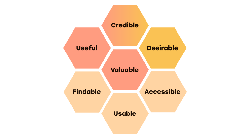
• Is it Usable?
• Is it findable?
• Is it accessible?
• Is it useful?
• Is it valuable?
• Is it credible?
• Is it desirable?
To help guide us on our journey for designing better experiences for users we can follow the UX laws.
The Laws of UX is a collection of best practices that designers can consider when creating user interfaces. We can utilise this knowledge to build more intuitive, human-centred experiences.
The UX laws use key principles from psychology as a guide for designing in a way that is adapted to people.
The 21 laws of UX and here a just a few…
Hicks Law
What it is: the time it takes to make a decision increases with the number of choices available.
Apply by: breaking complex tasks into smaller steps in order to decrease cognitive load.
Zeigarnik Effect
What it is: People remember incomplete tasks better than completed ones.
Apply by: encouraging user engagement with using visual cues, such as progress bars, to indicate incomplete actions.
Law of Feedback
What it is: Users expect immediate and clear feedback for their actions within a system.
Apply by: providing visual or auditory cues to confirm user interactions.
Peak-End Rule
What it is: People judge an experience largely based on how they felt at its peak and at its end, rather than the total sum or average of every moment of the experience.
Apply by: Identifying the moments when your product/experience is most helpful, valuable, or entertaining and design to delight the end user.
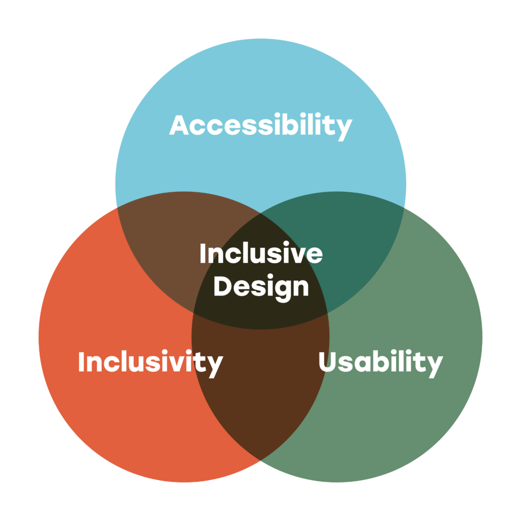
By keeping in mind these key psychology principles we can improve the experience our users have whilst using our websites. Another very important aspect of good user experience is inclusivity in design. Inclusive design has many aspects that sit inside it like ‘accessibility’, ‘usability’ and ‘inclusivity’.
Not having an inclusive design can affect a users experience by creating denied access, identity demeaning experiences and overall frustrating experiences. Inclusivity ensures a variety of voices are being heard when designing for diverse populations. When designing we need to design for all, we need to take into account different races, backgrounds, sexualities and ages.
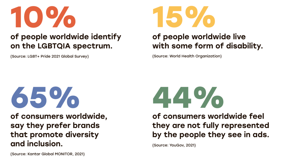
How important is inclusivity to our websites/products? Here are some stats!
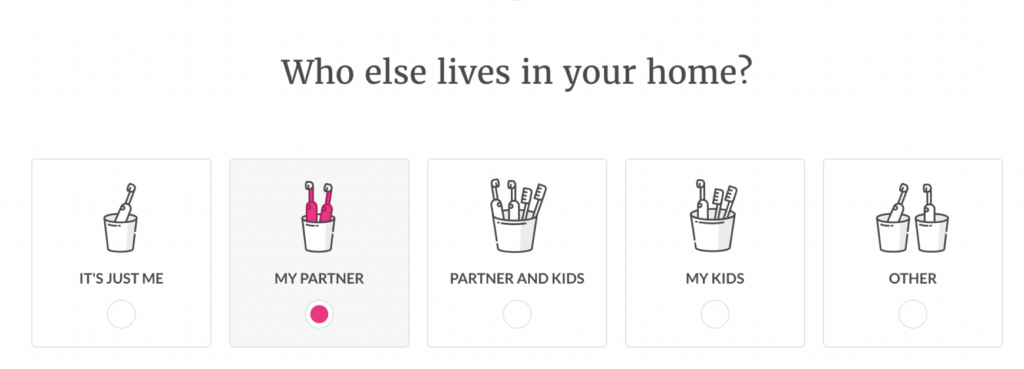
A good case study of a company using inclusive design to enhance a user’s experience is Lemonade. Lemonade, an insurance company, did a great job of making their sign up page inclusive.
When a new user signs up for their services they are greeted with 5 different options to choose from – but instead of using people and faces to describe the options such as ‘partner’, ‘partner and kids’ etc that could exclude people.
The key principle they used here was ‘abstracting images’. Abstracting images means departing from a realistic, detailed representation in favour of something more conceptual, but still human like illustrations or objects we interact with, for example the toothbrushes they use in their sign up page. Abstracting is a great way to ensure our users will not feel excluded.
Another way of making images more inclusive is to ‘diversify images’, so this means you seek to embrace all the multitude of differences users might identify with. You seek to represent the full spectrum of humanity in any imagery you use. A great example of diversification in images is the way former head illustrator Jen Hom at Airbnb updated their illustration set to be more diverse and embrace all races, ages etc.
There were many iterations within their design process to get to the final illustrations, but to simplify they made sure to use photographic reference for any illustrations they did, this made sure of two things: it ensured authenticity when depicting diversity because it left no room for the artist to generalise or stereotype, and it stopped the artist from drawing endless variations of their own face.
They also sketched out many face variations – jaw, forehead weight, noses, chin etc to get used to drawing many different types of faces.

The end product was a big improvement on their original illustrations which were only representing caucasian people. Now the new illustrations are a lot more representative of the diverse world we live in. This will help users feel more seen and recognised, leading to a better user experience overall.
It’s crucial that we carefully consider all these aspects of the user experience and continually enhance our results in this regard. Each of us bears the responsibility of delivering the most captivating, user-friendly, and enjoyable experience to our users.
“People ignore design that ignores people.” – Frank Chimero, Designer
In our web projects, we engage in collaborative workshops with our clients. These sessions revolve around gaining a deep understanding of their business objectives, the individuals who frequent their websites, and the objectives of these visitors. Through a series of interactive exercises, we collect invaluable insights during these workshops. This information becomes the cornerstone for crafting user journeys on our websites, ensuring that users can effortlessly navigate towards their intended goals.
If you found this information useful and want to find out more, please get in touch.
