
As Michael Bublé emerges from his retreat, Feliz Navidad regains his status on everyone’s beloved Christmas playlist, and the nation grapples with Emma Thompson’s emotional journey over THAT necklace, Carbon Creative takes a moment to reflect on the triumphs and pitfalls of rebranding initiatives throughout the years.
In a landscape filled with well-executed transformations and questionable choices (side-eye to X), let’s delve into some standout cases that have shaped the narrative of rebranding. From calculated and masterfully executed endeavours to head-scratching decisions.
So firstly, what is Rebranding?
The Cambridge dictionary defines a ‘rebrand’ as follows:
“if a company rebrands itself or a product or service that it provides, it creates a new name or image itself, often to try to change the way that people think about it”.
Famous Rebrand examples:
Definition and Purpose
Strategic Alignment
Innovative Approaches and Foresight
User Perception
Consumer Affinity and Caution Against Drastic Changes
Strategic Planning and Organisational Alignment
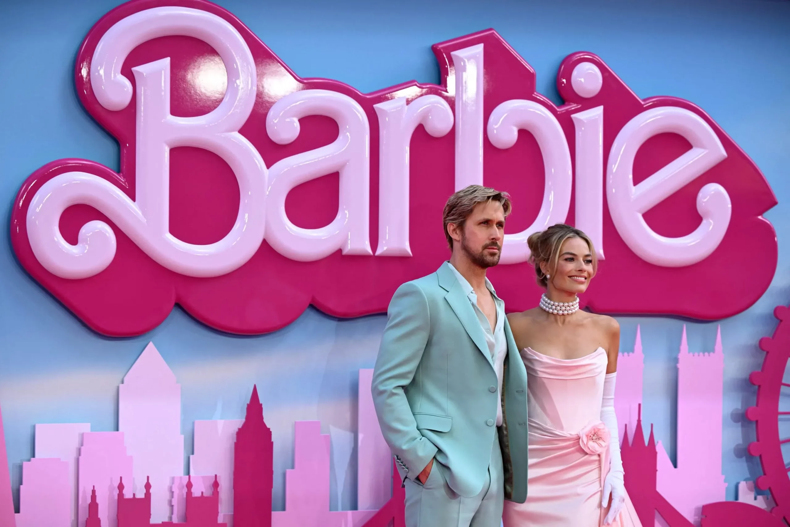
Barbie’s Resurgence:
- Definition and Purpose:
-
- Rebranding involves creating a new name or image to change public perception.
- The aim is often to reimagine and reshape the way people think about a company, product, or service.
 Fortune, 2023 photo here
Barbie deserves honourable mention for its impressive turnaround. “It was a brand that had sort of fallen out of culture, sort of had a bad rap, and was losing market share. Then, through this movie [and] through the multichannel and omnichannel activations, they were really able to enter into the cultural zeitgeist, change the conversation, reposition themselves, and reimagine Barbie moving forward, which was pretty amazing.” Hillel Hurwitz, CEO and founder of creative shop Bald, 2023.
The Barbie movie premiered on July 21, 2023, and along came pretty much every brand collaboration you can think of… Barbie x Crocs? No problem, Airbnb x Barbie? sorted, Bumble x Barbie? and countless more. It has been more than just a rebrand, it has created a cultural phenomenon. In fact, market share grew by 33% just in the run up. An ingenious branding strategy that will be celebrated and studied in many years to come.
Dunkin’s Bold Move:
- Strategic Alignment:
-
- Strategic rebranding doesn’t always necessitate a complete overhaul if aligned with the brand’s essence.
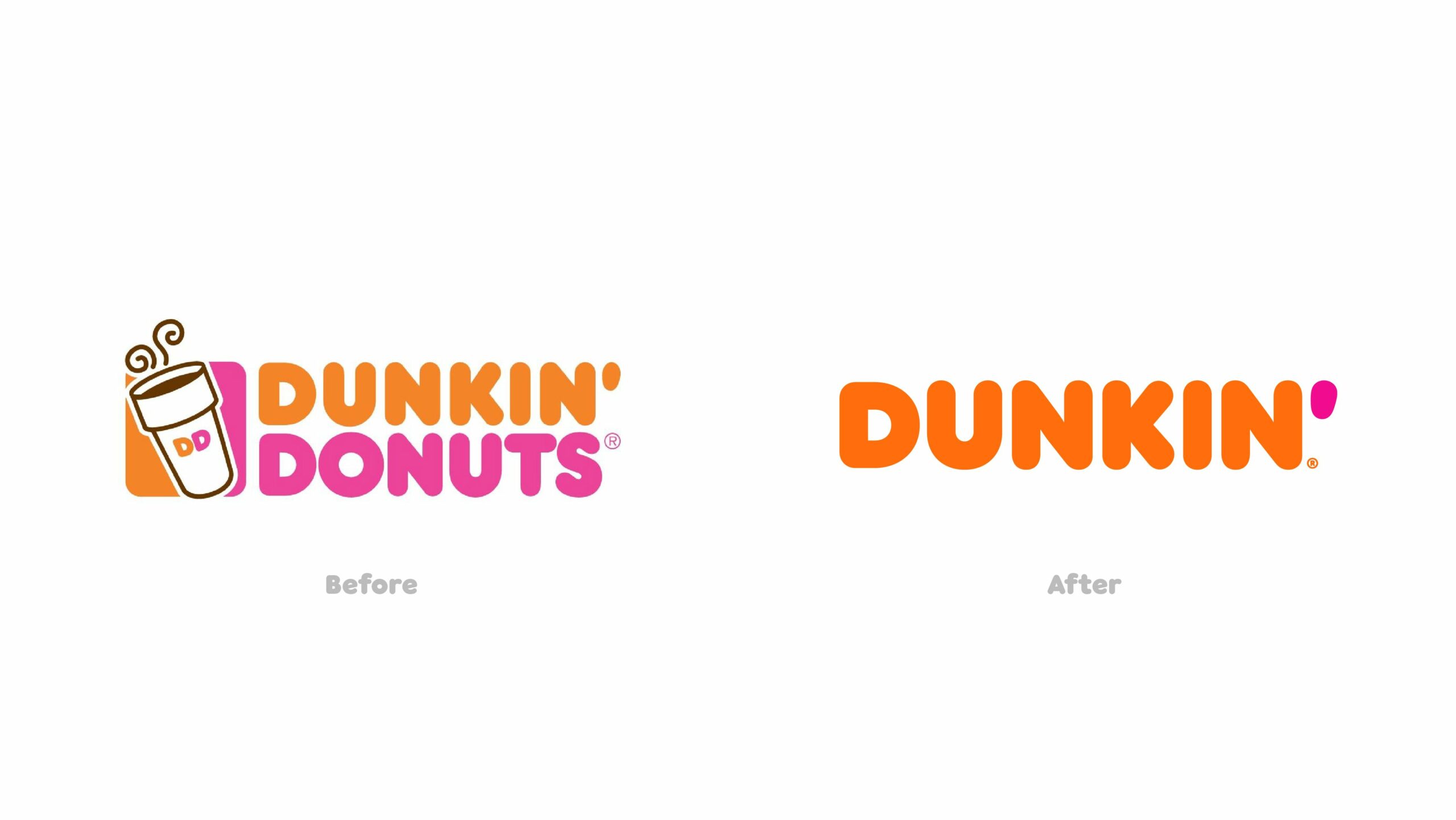 Dunkin Donuts, a stalwart in the coffee and baked goods industry, recognised the need for a bold move to fend off fierce competitors like Starbucks. In 2018, they embarked on a significant rebranding campaign, changing their name to simply ‘Dunkin’ and emphasising a ‘beverage-focused, convenient brand’ identity. The move paid off, showcasing that boldness can be effective if aligned with the brand’s essence. The key takeaway: strategic rebranding doesn’t always require a complete brand overhaul.
Newspaper sales declined, The Economist delivered.
- Innovative Approaches and Foresight:
-
- Demonstrates the impact of innovative approaches and the importance of anticipating marketing trends.
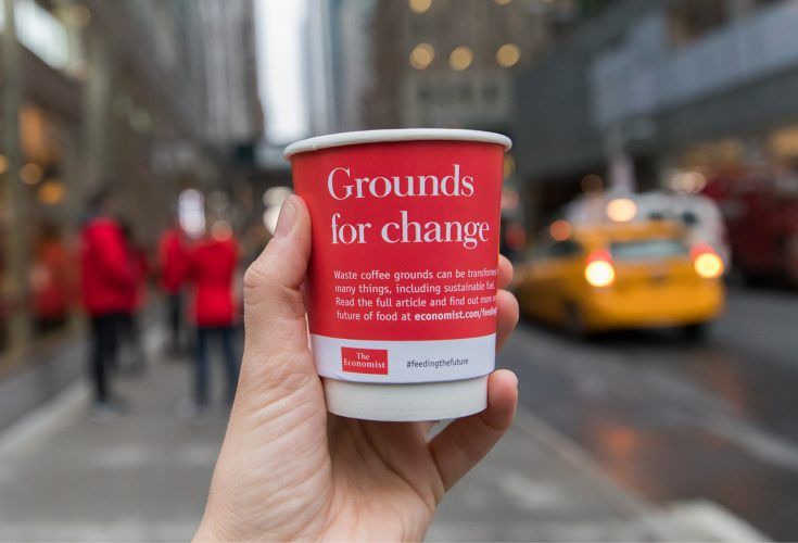
Certainly, an exemplar in the realm of newspaper rebranding, The Economist executed one of the most impactful strategies in history, earning not only numerous accolades but also solidifying its place as a paragon of brand reinvention. The campaign, unveiled in 2014, predated the ascendance of TikTok and the era of short-form video content, hinting at a foresight that positioned it ahead of contemporary marketing trends.
Far from conventional, The Economist’s rebrand ventured into uncharted territory, introducing elements that bordered on the avant-garde. Picture crepes adorned with insect toppings, coffee sourced from feline feces, and smoothies crafted from ingredients destined for the rubbish bin—all seamlessly integrated into the fabric of their experiential campaign. The results were impressive, with increased long term subscribership and a notable shift in brand perception that has been impactful almost ten years later.
On the edge of ‘X’tinction
- User Perception:
-
- Neglecting elements of colour and design psychology can lead to a disconnect and loss of brand equity.
 Image sourced from here
The recent rebrand of X, previously known as Twitter, spearheaded by Elon Musk, has become a subject of intense debate and criticism. The shift from Twitter’s familiar light and engaging aesthetic to a dark, dominating look adorned with a prominent X icon has been met with widespread disapproval.
The departure from the platform’s iconic cheerful, light blue bird logo to an imposing black, coupled with a bold X icon, marks a significant deviation from the brand’s established identity. This move seems to have overlooked crucial elements of colour and design psychology, disregarding the potential impact on user perception.
This case underscores the importance of a meticulous evaluation of the implications on audience perception before embarking on a rebranding journey. A brand is more than just a visual identity; it is a complex amalgamation of associations, emotions, and experiences. Neglecting these factors in a rebrand can lead to a disconnect with the audience and the loss of hard-earned brand equity. In essence, Elon Musk’s Twitter rebrand stands as a stark reminder of the delicate balance that must be maintained when considering such strategic shifts in a brand’s identity.
Tropicanas short-lived transformation
- Consumer Affinity and Caution Against Drastic Changes:
-
- Consumers have a profound affinity for familiarity, and straying too far from the established norm can prove detrimental if not cautious.
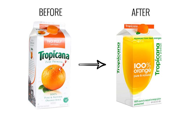 Image sourced from here
- Consumers have a profound affinity for familiarity, and straying too far from the established norm can prove detrimental if not cautious.
Tropicana’s rebrand lasted a shorter time than Kim Kardashian and Kris Humphries’ marriage… 30 days in fact, including an expensive $50 million pound divorce, minus an OK exclusive to cover the costs.
This serves as yet another compelling illustration that novelty doesn’t always equate to improvement. Consumers have a profound affinity for familiarity, especially when it comes to iconic brands. Straying too far from the established norm can often prove detrimental to its success. In the case at hand, experts attribute the failure of the rebrand to a seemingly simple analogy: it’s like replacing the image of oranges on a juice carton with a depiction of orange juice and an ‘orange’ cap.
While the visual and conceptual aspects of the rebrand were commendable, aiming to evoke the sensation of squeezing fresh orange juice upon opening the carton, the alteration in logo positioning and the introduction of new visuals rendered the brand nearly unrecognisable on the shelf for the average consumer. For decades, psychological studies on human behavior have consistently demonstrated a strong positive correlation between brand familiarity and consumer purchasing decisions.
Brands often underestimate the emotional impact they have on consumers, especially those who are loyal to the brand. This emotional connection stems from the brand’s reputation, encompassing its recognizable name and logo, which provides consumers with a sense of familiarity and assurance about the products they choose to buy. Tropicana’s case serves as a stark example, showcasing a 20% drop in sales when the key element of brand familiarity was removed.
This isn’t to suggest that iconic brands should never undergo a rebrand, but it emphasises the need for caution. Careful consideration of market dynamics, human psychology, and brand alignment is crucial to navigate the delicate balance between evolution and maintaining the core elements that consumers identify with and trust.
Gap’s Million-Dollar Misstep:
Strategic Planning and Organisational Alignment:
- Lack of prior buildup, explanation, and alignment with broader organisational changes contributed to its failure.
- The case emphasises the need for strategic planning and alignment with overall business strategies during rebranding efforts.
![]() Image sourced from here
Image sourced from here
Gap’s 100 million dollar rebrand in 2010, lasting a mere 6 days, was a significant misstep.
Let’s rewind to 2010, a time when the financial crash had just struck, causing Gap’s market share to plummet by 40%. Despite having enjoyed a previous market high with celebrity endorsements from the likes of Madonna, Will Ferrell, John Mayer, and others, the company found itself in a precarious situation. The apparent solution? A rebrand. However, this move was swiftly criticised as a hasty and panicked decision, described by Baekdal (2010) as a response driven by the need to “do something, and quick.”
Gap’s quick reversal to its old logo serves as a testament to the failure of its rebranding strategy. The introduction of the new logo garnered immediate and widespread negative feedback from both consumers and industry professionals. The abrupt change took people by surprise, lacking any prior buildup or explanation. Moreover, the rebranding effort seemed disconnected from any broader organisational changes, such as shifts in product offerings or alterations in senior management.
Conclusion
As we bid adieu to a year filled with rebranding highs and lows, and reflect on the major successes and failures over the years, the stories of Barbie, Dunkin, and The Economist serve as valuable lessons. Strategic alignment, boldness, and a deep understanding of market dynamics and human psychology are essential for successful rebranding endeavours. May these tales guide and inspire brands embarking on the transformative journey of redefining their identities.
